In March 2011, I presented “A study on GRASS, gvSIG, and QGIS communities based on indicators” at a conference. Later that year, I published the results of that paper as a series of posts in my blog: introduction (I), adoption (II), activity (III), work hours (IV), generations (V).
They merit their own place in the web. This article merges everything together.
- Introduction
- The authors
- The idea
- Public datasets
- What is it useful for?
- Adoption
- Activity
- Work hours
- Generations
- Coda
1. Introduction: a quantitative study on GRASS, gvSIG, and QGIS
When selecting an application, it’s very common to consider technological factors -what the application enable us to do?- and economic ones -how much money do we need? And yet, there is a third factor to take into account, the social aspects of the project: the community of users and developers who support it and make it be alive.
During a series of posts, I’m going to show a quantitative analysis of the communities of three free software projects in the Geographical Information Systems sector: GRASS, gvSIG and QGIS. They are the more mature projects in the space, they are under the OSGEO Fundation umbrella, and they show some differences on culture and organization.
The authors
The results that I’ll show come from a paper I led jointly with Francisco Puga, Alberto Varela and Adrián Eirís from CartoLab, a research laboratory from the University of A Coruña. The results were published on the V Jornadas de SIG Libre, Girona 2010. If you are fluent in Spanish (reading or listening), you can benefit from these resources:
- (in Spanish) The complete paper [PDF].
- (in Spanish) The slides [PDF].
- (in Spanish) Video explaining the highlights
From those who can’t, I’ll summarize the main points through small posts on this blog. The original authors have not reviewed the text as published, so consider any opinion expressed here as my own.
The idea
During the more than 25 years of free software movement, it has delighted us with the high capacity for fostering creation and innovation a community-based model has. Along last years, that model proved its viability in other areas too: content creation (wikipedia), cartographic data creation (openstreetmaps), translating books, etc. Yet, few is known on “how to bootstrap and grow a community”. The only thing we can do is observing what others have done and learn from their experience.
In order to contribute to the understanding on how a community-based project works I’ve work with Francisco Puga and other people from Cartolab to put together some of the public information the projects generate and make some sense from that. The actors in a community interact with each other, and, when that happen through internet, a trail is left (messages to mailinglists have author information and date, code version systems log information about the authors too, …). Basing our work on this available and public information -and standing on the shoulder on giants –i.e: reviewing a lot of research works similar to what we like to build- we have developed a quantitative analysis on the communities supporting GRASS, gvSIG and QGIS.
Public datasets
The first step was to evaluate and gather all the public information a project, for what we like to do it in automated way. But, as we had to compare the 3 projects, the data had to be homogeneous: at least exists in both 3 and be in a comparable format. Taking these constraints into account (and the limited time we had for this!) we have collected information from 2 different systems:
- Code versions control systems: from every project, we cloned all information available in their repositories to a local git repo, in order to parse the log of changes. This allowed us to study all the history of projects, from the very begining to December 2010.
- Mailinglists: by means of mailingliststats tool -built mainly by our friend Israel Herráiz, thanks bro!– we gather data from March 2008 to December 2010.
Some disclaimers:
- Projects have a number of branches, plugins and so. We focused the study on the main product, what an user get when she downloads it. Further study on the plugins ecosystem is needed, and it will give us more fine-tuning information.
- Projects have a number of mailinglists more than we have studied (translators, steering committee, other local/regional mailinglists, etc), varying on each case. The analysis was focused on developers and users ones due to we think they are representative enough to mark the trend. We are not interested in giving an exact number (which may be impossible to measure!) but in drawing the long-term fluctuation of participation. Our intuition and past experiences, says that those mailinglists will follow a correlation of participation with the larger community surrounding the projects.
- In the particular case of gvSIG users mailinglists, we have studied spanish and english mailinglist jointly. It makes sense doing so as the spanish mailinglist still have the core of contributions from hispanoamerican countries and non-spanish people interacts through international mailinglist. It is like the project have two hearts.
- Unfortunately, quality of data have limited the period in study: the range is from March 2008 to December 2010. Prior to that, not all projects have information due to mailinglist migrations.
What is it useful for?
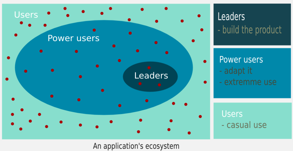
It’s possible to analyze a community from a variety of points of view. Our approach is a quantitative focus by means of a common model which agregate users depending on their level of participation:
- Leaders: those who build the product and make the decisions.
- Power users: those who adapt it to their needs and using it intensively.
- Casual users: those who using it for a concrete task.
This approach allow us to better understand the size of the community and how they interact, as it’s not the same the value provided by someone who in 6 months only sent 1 mail to a mailinglist than other person who spent that time sending more than 100 patches to the code.
With these constraints, we managed to built the following indicators:
- Adoption trend within users and developers: based on mailinglists data.
- Status: post published.
- Activity and manpower: based on code contributions (commits).
- Status: post published.
- Composition of the community: based on code contributions (commits).
- Status: post published.
- Generational analysis: based on code contributions (commits).
- Status: post published.
During next weeks, I will be publishing the results of the study, in order to help us to understand how different free software communities work, and what we can learn from that.
2. Adoption
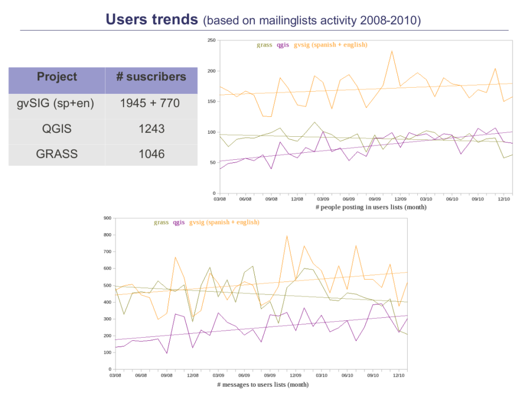
Find below the statistics for mailing list activity in GRASS, gvSIG and QGIS during the period 2008-2010. The first one shows data from the general user mailing lists for each project. Take into account that data for gvSIG aggregated both international and Spanish mailing list due to the reasons stated here.
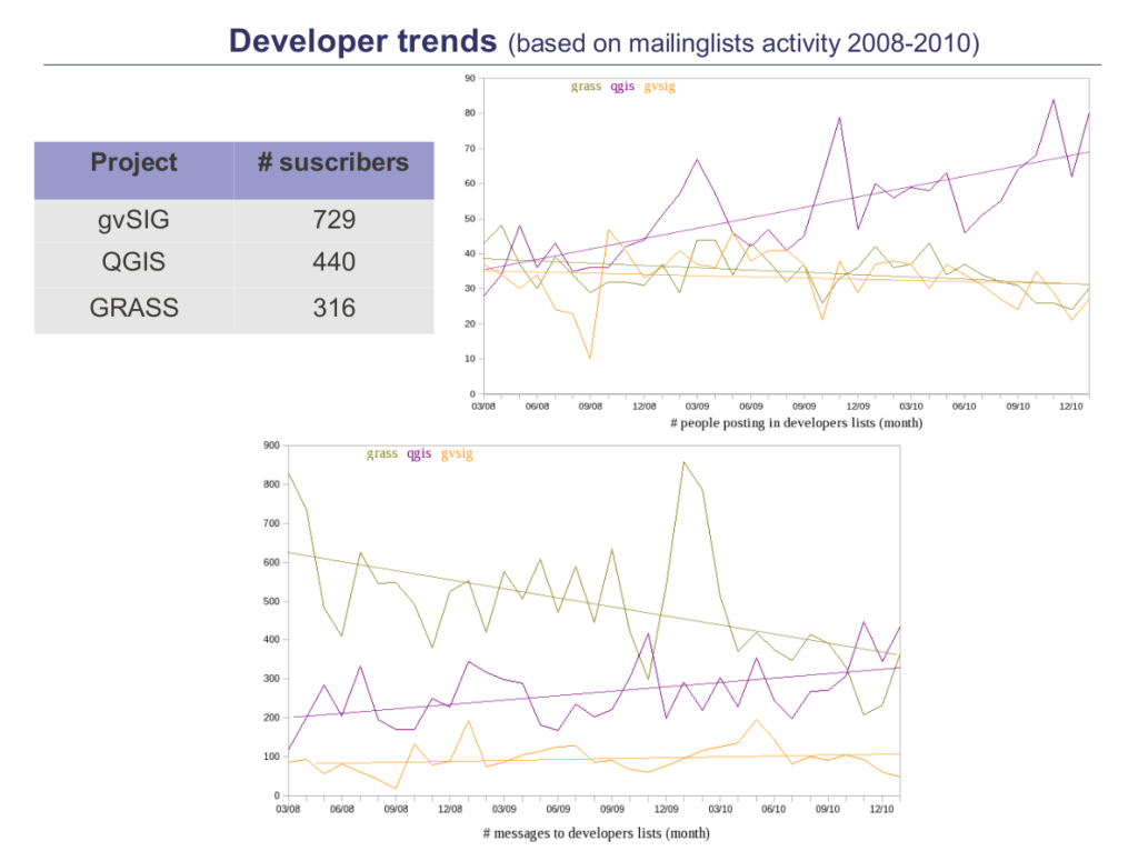
The next one shows the same data (number of people writing and number of messages by month) for the developers mailing lists.
Data patterns
Well, certainly not the user base. The data shyly introduce us the trends, not the real user base. The model we adopted to study the projects reflects just a part of the community -which is arguably the engine of the project- but don’t take the data as the number of users for each project. For sure, each one of our favorite projects has more users than those participating in (these) mailing lists!
Anyway, here some food for thought:
- GRASS: it smoothly decreases in terms of number of messages as well as people writing, which happen within users and developers. The tendency is not clear, though.
- gvSIG: the data shows a steady increasing number of users participating in the mailing lists. On the other hand, although it is the project with more people subscribed to developer mailing list, it shows the less activity of the three projects (in terms of # of messages in developer lists): few technical conversations seemed to happen through the mailing lists during that period.
- QGIS: according to the data, a clear growth exists in the community. In the period of study (3 years) the number of users and developers participating in mailing lists has been doubled!
Few more can be said, hope the graphics help enough to understand! Looking forward to your feedback.
3. Activity
- Images: on the left, the number of changes to the codebase (commits) agregated by year. On the right, the number of developers with at least 1 commit that year.
- Data: trunk from project repositories during the period 1999-2010.

Data patterns
Certainly, not the number of features developed or bug fixes. It is even barely possible to compare activity between projects, as there are a high variability in terms of changesets: some people could send several little changesets and others just 1 big change, some project could have a special policy which affect the results (i.e.: make a commit formatting the code accoring to the style rules and other with the changes), etc. Some people could even argue that the language they are written in affects the number of changes (GRASS is written in C, gvSIG in Java and QGIS in C++) due to the libraries available or the semantics of every language. So, is it possible to find out something? Well, in my opinion, we can trace at least the following:
- the internal evolution of a project.
- how a project is doing in terms of adding new blood.
So, let’s make again the exercise of finding out what’s happening here:
GRASS
- It calls the atention the curve of activity in the project: growth by periods (2001-2004 and 2005-2007) with local maximums in 2004 and 2007. Our hypothesis was that it was due to the way the project works: the developers here make changes both in the trunk and in the branch of the product to release (be it 6.4 or 6.5) at the same time, with a lot of changesets moved between both the trunk and the branches (so doing heavy backporting). In a recently conversation with Markus Neteler, he has explained me better how they work and I guess the rhythm we see in the graphics is due to that.
- In terms of number of developers, GRASS has showed a continuous growth until 2008; since then, the number of regular developers stabilizes.
gvSIG
- gvSIG shows an incredible high period of activity during 2006-2008 (4500 changesets by year and most that 30 people involved!). To understand the Gauss bell of activity, is needed to know the background of the project: gvSIG development has been led by contract, which means that all activities (planning, development, testing, etc) were led by the client needs who pay for it. Only recently, these processes have been opened to a broader community (firms and volunteers collaborating in the project within the gvSIG association). So, it makes sense that the beginnings had seen less activity (high phases of planing) and afterwards they got to agregate so many people in such a short period of time.
- But, in 2010 it suffered a sudden stop in development (only 233 changes to the codebase were made, while a pace of 4500 changes were made during previous years). This decreasing in activity is highly correlated to the number of developers involved. It’s hard to say why it happens: could it be due to the efforts were directed to gvSIG 2.0 development? could it be due to the reorganization in the project and the creation of gvSIG association? Well, few can be said at this respect with the data available, further research is required to determine that.
QGIS
- Steady grow both in terms of contributions and contributors. 2004 and 2008 years determine two peaks of activity and people participating in the development. Our preliminar hypothesys was that it was due to the release of the first stable version and the release of 1.0, as well as become an oficial project of OSGEO. Gary Sherman has confirmed that in a recent post (history of QGIS commiters) and an interview (part1 and part2). Besides, he pointed out that in 2007 the project added python support for plugin development, which possibly was one of the reasons of the growth in 2008 and afterwards.
- An interesting finding is that, every 4 years the project has doubled the amount of developers involved with a slower but steady growth in activity.
Well, hope these graphics have helped us to understand better how is the project activity and the manpower every project is able to aggregate around it. The next post in the series will focus on the developers involved and the culture surrounding them. Looking forward to your feedback!
4. Work hours
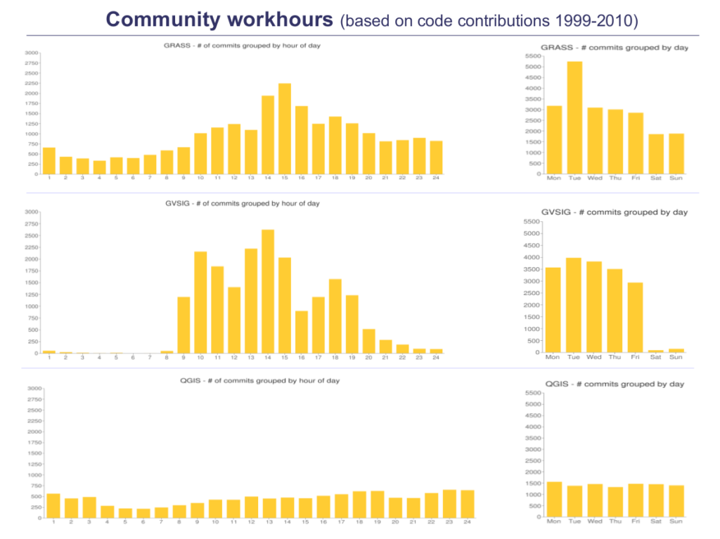
- Images: on the left, number of changes to the codebase (commits) agregated by hour of day. On the right, number of commits grouped by day.
- Data: trunk from project repositories during the period 1999-2010.
Data patterns
This indicator is intended to give us some information on the patterns of behavior of contributors. Specifically, we can track how is a typical week for the core developers in every project: the timeline shows when the integration happened, don’t reflect the time in which the work was done; so it’s telling us the history of people with commit permissions, what we know as the leaders.
Let’s try to extract some information from there:
GRASS
- Internationalization: the hourly chart represents a gauss bell centered on 15h GMT, which in most European countries would be after lunch, being morning in the Americas. That could reflect that both continents represent the vast majority of core commiters. Nevertheless, the work is relatively well distributed along different hourly zones.
- Volunteers: the daily chart shows a light drop of work during the weekend, likely due to hired developers or people who likely make contributions mostly within their working hours. Nevertheless, there is still a high rate of contributions being integrated during weekend, which may be a sign of a well stablished volunteer base of core-developers.
gvSIG
- Internationalization: almost all the integration happens in a journey from Monday to Friday, with a hourly range from 09:00 to 20:00 GMT. That is strongly correlated to the hours of opening of a typical shop in Spain and reflects the nature on how the application was built in that period: led by a public body which contracted development to Spanish firms.
- Volunteers: seems that volunteer work in core was reaching to none, which reflects the original nature of the project in that period.
QGIS
- Internationalization: the hourly chart is nearly to a plain rate of contributions, which is a strong sign of a highly distributed leadership along the world. It’s even difficult to suggest which zones would be the prominent in terms of developers.
- Volunteers: the daily chart reflects a steady work along the week, with no signs of falling during the weekend, which may be related to a strong base of volunteers core commiters.
5. Generations
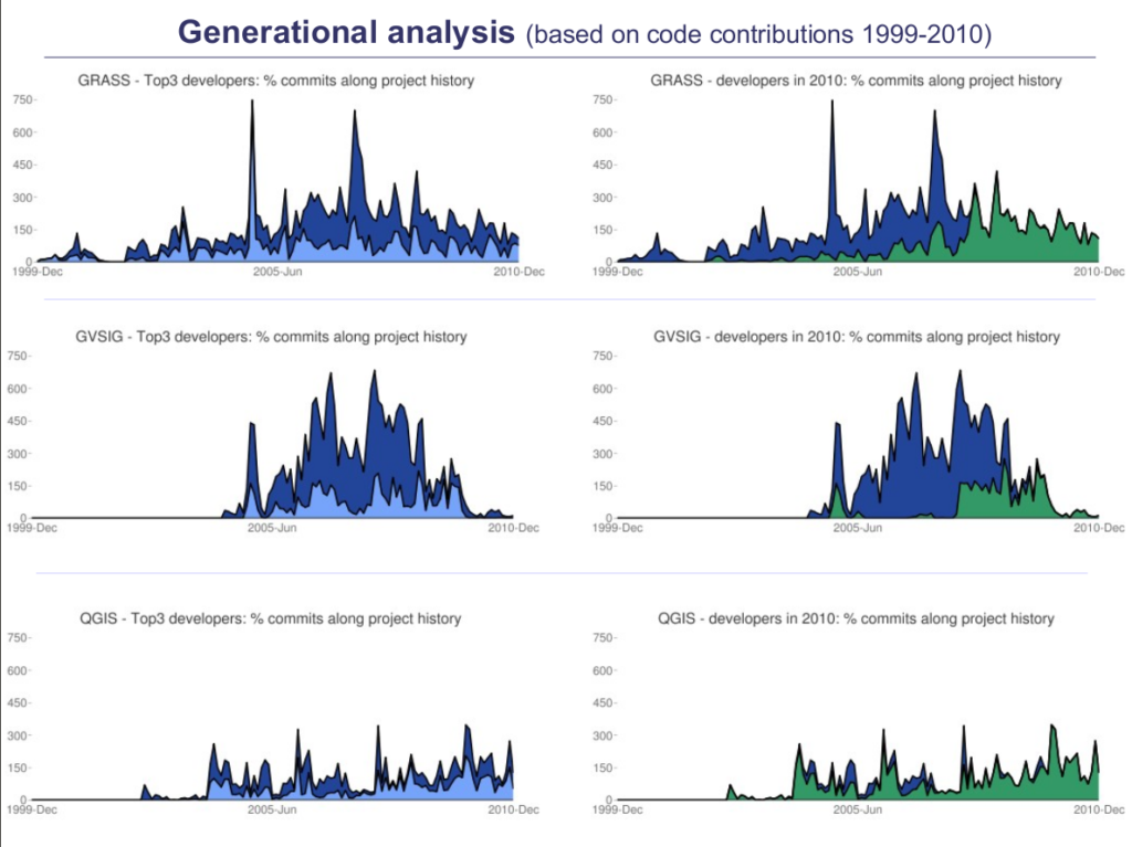
- Images: on the left, contributions of top 3 developers along the project history; on the right, evolution of developers participating during 2010.
- Data: trunk from project repositories during the period 1999-2010.
Data patterns
This indicator gives us some sense on how the leadership changed and how the knowledge transfer was done in every project. The paper elaborates a bit more the points of turnover and integration of new blood in the project (highly correlated with this indicator) with statistics of top 10 developers.
All that will give us some insights on every project:
GRASS
- The charts and data depict how a new generation took over the leadership from 2005 onwards. The process seems to be happened in a very organic way -in the sense that people grew its skills at a steady pace for a long time- and also deep to the roots: from the top10 only 4 out of 10 people continue collaborating with the project.
- The data also shows how the top3 represent half of the work in the project, which suggest that several developers are highly involved with no one having too much influence (actually, the top contributor during 2010 means 40% of work).
gvSIG
- The charts and data depict a highly distributed team with a high rate of turnover. Top3 is responsible for less than half of the contributions, being top10 around 60%. The change of leadership happened very quickly around 2007 and only 2 out of 10 contributors from top 10 kept working in 2010.
- Besides, the top10 shows a homogeneous involvement in terms of number of contributions, which may reflect that all of them had a similar role and impact in the development of gvSIG.
QGIS
- The charts and data depict a project dependent of its top3 with a contributions-friendly culture. Top3 activity means a high rate of contributions over total but seems they have integrated well new blood as 9 out of 10 most active developers working in QGIS have started in different years and continue involved.
- Top10 people have different ratios of involvement, ranging from 6% to 50%, which may reflect the heterogeneity of its core developer base (from volunteers to full-time developers).
6. Coda
Fran and I came out with the idea for the paper. Our intention was to foster the debate on the best practices around a free software project.
While at CartoLab, we presented the idea to Alberto. He encouraged us to work on it and gave us the time and resources needed. He also contributed to polish the trends and conclusions in the later stages. I’m deeply grateful for all his patience and empathy.
This is the first study of this kind in the GIS arena, and a picture of 10 years of FOSS4G software development (for the desktop side). I hope it continues to create debates on how to better work together.